top of page
Alexandra Gilman
Senior Brand Designer & Art Director
15 years · Brand Systems · Visual Language · Global Clients
I turn complex business problems into clear visual systems. From NASDAQ-listed companies to early-stage startups, I've built brands that scale, decks that close deals, and design systems that teams actually use.
Founder & Lead Designer in Deezeye
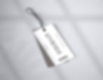
Reshef Fuzes
Technologies - Electronic Fuze Manufacturer
Rebranding a defense manufacturer with three decades of precision to look the part.
.jpg)
.jpg)
.jpg)
Senior Designer at Tamooz Agency | Design Lead - Direct to CEO - 2022
The engineering was battle-proven. The brand wasn't.
A leading developer of electronic fuzes for artillery, mortars, tanks, and rockets - with a visual identity that didn't reflect three decades of engineering expertise. Needed to look as precise and serious as the products they make.
Redesigned the logo. Built the full brand identity and visual language. Designed all collateral - stationery, ID cards, brochures, presentations. Redesigned the website.
Logo redesign | Brand identity | Website redesign | Stationery | Brochures | Presentations | Corporate collateral
Gave a defense industry manufacturer a visual identity that matches the precision and seriority of its products. The red + dark system communicates authority in a market where trust is non-negotiable.
.jpg)
.jpg)
.jpg)
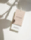
Kpiminav / Criminal
Bold Clothing for Free People
Created a luxury streetwear identity that fuses Cyrillic typography with high-fashion sensibility, for a brand that positions itself as clothing for free-spirited people.


Freelance Designer (Contract)
Where Cyrillic heritage meets bold fashion.
Kpiminav / Criminal was launching from zero as a fashion brand that needed to feel both rebellious and refined. New brand with a provocative name that needed careful visual translation. Wanted to mix Cyrillic script with contemporary fashion aesthetics. Needed a visual system that could feel timeless yet edgy, classic yet audacious. Had to work across apparel, a fragrance line, retail signage, packaging, and branded merchandise.
Designed a complete brand identity that balances provocation with sophistication. Developed a custom Cyrillic logotype fusing classic serif elements with contemporary, edgy details. Built a color system around deep, rich tones and sophisticated neutrals with bold accents. Designed the full merchandise line branding. Created fragrance bottle and packaging design. Designed retail storefront signage and environmental graphics. Developed branded collateral. Created a pattern system using the Cyrillic logotype as a repeating motif.
Custom Cyrillic logotype & brand identity | Merchandise & apparel branding | Fragrance packaging design | Retail signage & environmental graphics | Stationery & branded collateral | Pattern design for textiles & wrapping
The Cyrillic logotype became the brand's most iconic asset, working as both a wordmark and a pattern. Successfully bridged street culture and luxury fashion. The brand identity scaled seamlessly from clothing tags to fragrance bottles to retail storefronts. Created a versatile design system that allowed the brand to expand into new product categories while maintaining a cohesive identity.


Noire Crime
Apparel for bold personality
Created a bold streetwear identity for a Ukrainian apparel brand that refuses to blend in, built around a distinctive emblem and a razor-sharp black and red visual system.


Freelance Designer (Contract)
Built a streetwear brand with edge, not compromise.
Noire Crime was launching from zero into the hyper-competitive streetwear market, where visual identity is everything. New brand with no recognition in a saturated fashion space. Needed a visual identity that felt edgy and distinctive without being gimmicky. The brand's name and attitude demanded a design system that could convey boldness and rebellion. Had to work across apparel, accessories, stationery, and social media.
Designed a complete brand identity system built around contrast and attitude. Created the Noire Crime logotype and a modern cross emblem that became the brand's signature mark. Developed a bold black-and-red color system. Designed clothing labels, hang tags, and garment branding. Created skateboard deck graphics. Built the Instagram visual strategy. Designed stationery and business collateral.
Logotype & brand emblem | Apparel branding (labels, tags, garment placement) | Skateboard deck design | Social media strategy & content design | Stationery & business collateral | Signage design
The cross emblem became an instantly recognizable brand mark that works at every scale. The black-and-red system gave Noire Crime a distinctive shelf presence. Social media strategy drove community engagement and brand awareness. Built a design system flexible enough to scale across apparel, accessories, retail, and digital without losing its edge.
.webp)


Originario
Food Discovery Web Platform
Built the brand, platform design, and packaging system for an Italian food discovery service that brings curated tasting boxes to food lovers worldwide.


Freelance Designer (Contract)
Contracted as the sole designer responsible for the full creative output. Worked directly with the founders to translate their vision of Italian food culture into a cohesive brand and digital experience.
Turned Italian food storytelling into a brand you can taste.
Originario was a new platform launching from zero, aiming to connect global food enthusiasts with hidden Italian culinary treasures through monthly tasting boxes. No existing brand identity in a crowded food subscription market. Needed to communicate authenticity, heritage, and discovery without feeling old-fashioned. The brand had to work across a web platform, physical packaging, stationery, and wine labels. Had to feel premium enough for wine and food connoisseurs, yet approachable for curious newcomers.
Created the entire brand ecosystem from concept through production. Designed the Originario logotype with a custom typographic approach that blends Italian elegance with modern discovery. Developed the web platform design, creating an immersive experience that maps Italy's culinary regions. Designed the full packaging system for tasting boxes, including wrapping paper, tags, and unboxing materials. Created wine bottle label designs. Designed stationery, business cards, and brand collateral. Built a visual system rooted in deep reds, warm neutrals, and subtle cartographic elements.
Brand identity & logotype | Web platform design (UX/UI) | Packaging design (tasting boxes, wrapping, tags) | Wine label design | Stationery & business collateral | Menu and promotional materials
Created a distinctive visual identity that positioned Originario as a premium discovery platform, not just another food subscription box. The cartographic design elements became a signature brand asset. Packaging design elevated the unboxing experience into an extension of the brand story. Built a scalable design system that worked seamlessly from digital screens to physical wine labels and retail environments.


Telcon
Global manufacturer of PCD & CVD diamond cutting tools
Turning a legacy industrial manufacturer into a brand that matches the precision of its products.


Design Lead - Project-based - 2023
Worked directly with their developer to implement the redesigned website and ensure design-to-code accuracy.
The engineering was world-class. The brand finally caught up.
A world-class manufacturer supplying Airbus, Lockheed Martin, and Embraer - with a website and materials that looked 15 years behind the product quality. The visual presence didn't match the engineering.
Complete website redesign - from dated white/grey layout to a premium dark aesthetic that reflects the precision of diamond cutting tools. Redesigned all corporate presentations and sales materials. Created product pages, case study layouts, and technical documentation design. Built a visual language that communicates industrial authority.
Website redesign | Corporate presentations | Product catalogs | Sales collateral | Technical documentation design
A manufacturer selling to aerospace giants now presents itself at the same level. The dark, technical aesthetic positions Telcon as the premium choice in a market where most competitors still look generic.


Mylo.Ai
AI-Powered Dating App
The 21st designer they hired. The one who finally stayed and built it.


Head of Design - 2023-present
Work directly with the CEO and marketing lead. Guide 2 designers, external UGC creators, and US marketing teams. Collaborate with the developer on product implementation.
20 designers before me. 3 years later, I'm still here, now leading the team.
Mylo had been through 20 designers. The UX was outdated and messy, the brand had no identity, and nothing held together. They needed one person who could own everything - not another handoff.
Redesigned the logo and built the full brand identity from scratch. Rebuilt the entire UX/UI - flows, screens, components. Mylo 3.0 launching soon. Created the AI companion character system that became the brand's face. Designed and directed social campaigns, video campaigns, paid ads. Built and launched the new website. Chose typography, defined the visual language (the dark + purple + orange system). After 3 years of solo work, hired and now lead 2 designers as the company prepares for US launch.
Logo & brand identity | UX/UI design (full product) | AI character system | Website | Social & video campaigns | Paid advertising | Marketing collateral | UGC direction
Joined as the only designer after 20 others couldn't stick. Built the brand, rebuilt the product, grew into Head of Design. Now leading a team of 3 preparing for US market launch with Mylo 3.0.


Marketflows
Strategic Marketing Platform
Logo & Brand Identity.


Design Lead - Direct to CEO - 2022
Gave a fintech startup its first real face.
An early-stage fintech startup with no visual identity. Needed a logo and brand direction that could stand next to established competitors and signal credibility to potential clients.
Designed the logo - the flowing green line system that represents market momentum. Defined the brand style - color palette, typography, visual language. Created stationery, business cards, and brand collateral. Designed the app UI direction.
Logo design | Brand identity | Color & typography system | Stationery & collateral | App UI direction
Delivered a complete brand identity directly to the CEO. The green + dark system gave a new startup an identity that reads as established fintech, not scrappy newcomer.


NIBANA
Beach & Yard Items
Built an entire brand from scratch for a premium beach lifestyle company - from logo to product design to e-commerce.


Solo Designer & Brand Lead - Managing the marketing team
Hands-on execution of all design work while directing and managing the marketing team. Owned every visual decision from concept to final production.
From zero to a fully realized coastal lifestyle brand.
NIBANA was a brand-new business launching from zero in a crowded beach accessories market. No existing brand identity, visual language, or market positioning. Needed to stand out in a category dominated by generic, mass-produced products. Required a cohesive brand that could bridge physical products and digital presence. The product itself needed design thinking - not just the marketing around it.
Created the complete brand identity and visual system from the ground up. Designed the logotype and full brand identity system. Developed the e-commerce website (UX/UI and visual design). Created all packaging design and product labeling. Participated in the physical product development - material selection and shape design for the beach umbrellas themselves. Built a social media visual strategy and content templates. Established a warm, organic visual language that communicated premium quality and coastal lifestyle.
Brand identity & logotype | E-commerce website design | Packaging & product labels | Physical product development (material & shape) | Social media design system | Marketing collateral
Took the brand from concept to market-ready across every touchpoint. Created a distinctive visual identity that elevated beach accessories into a lifestyle category. The rebrand injected vitality into the product line, diversifying its appeal and reducing visual monotony. Overcame market visibility challenges by establishing a strong, recognizable brand presence. Built a scalable design system that the marketing team could execute independently.


Aeronautics
Defense & Aerospace (UAS)
Making a drone manufacturer look as advanced as what it flies.
.jpg)
.jpg)
.png)
Senior Designer at Tamooz Agency | Design Lead - Direct to CEO - 2022
Sells to 20+ countries. The booth finally showed it.
A global defense company selling unmanned aerial systems to 20+ countries, but the brand materials and exhibition presence didn't communicate that scale or sophistication.
Refreshed the visual language (logo stayed, everything around it evolved). Designed exhibition booths for major defense expos - multiple shows, large-scale builds. Created all corporate collateral - brochures, stationery, presentations. Redesigned the website. Built the green + dark visual system that carries across all materials.
Brand refresh | Exhibition booth design (multiple expos) | Website redesign | Brochures | Corporate collateral | Stationery | Presentations
A defense company selling to 20+ countries now shows up at expos looking like a global player. The booth presence became the brand's strongest asset.
.jpg)
.png)
.png)
Melisron
Leading Real Estate Company (TA-35)
Making financial and ESG data readable for the investors who move markets.


Recurring Design Lead · 2022–2026 (on-demand)
Come in annually to finalize and elevate all investor-facing materials produced throughout the year. Design and refresh all decks, ESG reports, and corporate presentations hands-on. Structure dense financial and ESG data into clear, scannable narratives
Consulted on the website's look and feel (direction, not execution)
The data was all there. The story wasn't.
Melisron produces massive volumes of financial and ESG data annually — investor decks, market reports, ESG disclosures. The content was all there, but it arrived inconsistent and visually flat. Every year it needed to be elevated, restructured, and made presentable to institutional investors and analysts.
Designed a structured presentation system for investor and corporate communication
Defined clear hierarchy for financial and ESG data
Created modular slide structures for recurring content
Standardized visual language across decks and reports
Improved clarity of ESG reports for stakeholders and decision-makers
Investor decks · ESG reports · Corporate presentations · Market update decks · Website consultation
Retained annually as the designer who makes their most important materials investor-ready. The presentation system I built is reused and updated each cycle.


CryptoKey
Cryptocurrency Market Signals Channel
Turning chart screenshots into a brand people actually trust.


Design Lead (Remote) - Brand built from zero
0 to 9K followers in 2 weeks with a brand system built entirely from scratch, remotely.
A crypto signals channel with nothing but chart colors. No logo, no brand system, no visual identity - in a market where every competitor looks the same. Needed to stand out as credible and professional in a space full of noise and scams.
Designed the brand from scratch - 3 logo directions, they picked the winner. Built the entire visual system for Telegram channels (the primary platform - this is where signals live). Created a unified social media system across channels. Designed paid ad campaigns. Built investor presentations. Guided all ongoing social content production.
Logo & brand identity | Telegram channel design system | Social media content | Paid advertising | Investor presentations | Business cards & collateral
Client consistently recognized by name in the signals community, a space where most channels are anonymous and disposable.


Swifter.io
Modular Insurance Platform
From a logo to a full brand - built for enterprise credibility in insurtech.


Design Lead (End-to-End) - 3 years - Project-Based
From a logo and a few social posts to a brand that walks into enterprise rooms.
Swifter had a logo and scattered social posts. No brand system, no visual language, an outdated website, and no credible presence for a company trying to sell to enterprise insurance clients.
Built the entire brand language from scratch - color, typography, layout logic, component system. Redesigned the website for enterprise credibility. Designed expo booths, attended every exhibition alongside the CEOs. Created all investor and sales presentations. Planned and executed social media visibility and brand recognition strategy. Built brochures, sales materials, and marketing collateral.
Full brand system | Website redesign | Exhibition booth design | Investor presentations | Sales brochures | Social media strategy & content | Event planning & presence
Over 3 years, built everything the company uses to present itself - from the website to the expo floor. Attended exhibitions alongside leadership, shaping how the brand showed up in person, not just on screen.

.jpg)

GE Healthcare
Fortune 500
Unified brand experience for GE's women's health ultrasound division across international medical congresses.


Senior Designer at Tamooz Agency 2016-2018
Brought a patient-first voice to the world's leading women's health ultrasound brand.
Worked within GE's global brand compliance and medical-legal review. Designed clinical materials validated by leading OB/GYN specialists. Centered the 'Because She Needs to Know' campaign on patient outcomes rather than product specifications.
Exhibition booth and environmental graphics for international congresses. womens-health.net - the Voluson clinical website. Clinical education posters for healthcare professionals (fetal heart, reproductive medicine, congenital heart defects).
Exhibition design | Website | Clinical education materials
Two years of unified brand experience across physical and digital touchpoints at international medical congresses.


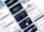
Ensights
All-in-One Optimization Platform
Gave a technical platform a distinctive voice across every channel. Focused on turning complex data into clear, structured messaging.


Project-Based Head of Design • 2024–2025
Collaborated with their in-house designer — introduced the new visual system and trained them to maintain it independently.
Gave a technical platform a voice people actually recognize.
Design and communication were fragmented across channels, with no consistent visual or communication system
Different outputs lacked cohesion
Data-heavy content was difficult to understand
No shared standards across marketing, product, and reports
Built a unified visual system using existing brand foundations
Introduced a clear hierarchy for data-heavy communication
Developed a social and marketing framework with a distinct editorial tone
Designed reports and presentations for investor and enterprise audiences
Created templates to ensure consistency across all future outputs
Unified brand presence across all channels Improved clarity in data-driven communication Enabled consistent output across teams and content types
Used across investor events, research publications, and presentations. Stakeholders consistently commented on the refresh.


SolarEdge
NASDAQ-Listed Global Leader in Smart Energy
In-house design leadership across brand, product, and marketing. Brought design leadership to a company that had never had it.

.jpg)
Head of Design (In-house) • 4.5 years
Hands-on execution alongside leading design direction
Worked across departments to align teams around consistent branding
One company. One visual language. Built the team to keep it that way.
Design was fragmented across teams, with multiple freelancers and no consistent visual direction.
Different outputs lacked cohesion
No shared standards across teams and regions
Growing company with increasing design needs
Defined and introduced a unified visual language across all touchpoints
Led visual direction for SolarEdge Home and key product communications
Guided freelancers and internal designers to work within one system
Public-facing campaigns
ESG and investor reports
Presentations (internal & external)
Product and marketing materials
Brochures and corporate collateral
Exhibition booths and event design
Unified brand presence across previously fragmented outputs Improved consistency across teams, freelancers, and regions Enabled scalable design production as the company and team expanded


Taub Center
Center for Social Policy Studies in Israel
Institutional brand redesign for investor & policy audiences. A 40-year-old brand refreshed for investors, without losing what made it recognizable.


Lead Designer (Solo) • 2024
The system is actively used across research, events, and investor materials today.
40-year-old brand with strong recognition but inconsistent execution across research, events, and investor materials.
Unified typography into one bilingual system (Noto Sans Hebrew)
Refined logo for consistency while preserving recognition
Built a modular grid system used across all assets
13+ asset categories including:
Brand guidelines
Presentation templates
Reports & publications
Event collateral
Social & web
Used across investor events, research publications, and presentations. Stakeholders consistently commented on the refresh.


bottom of page